|
|
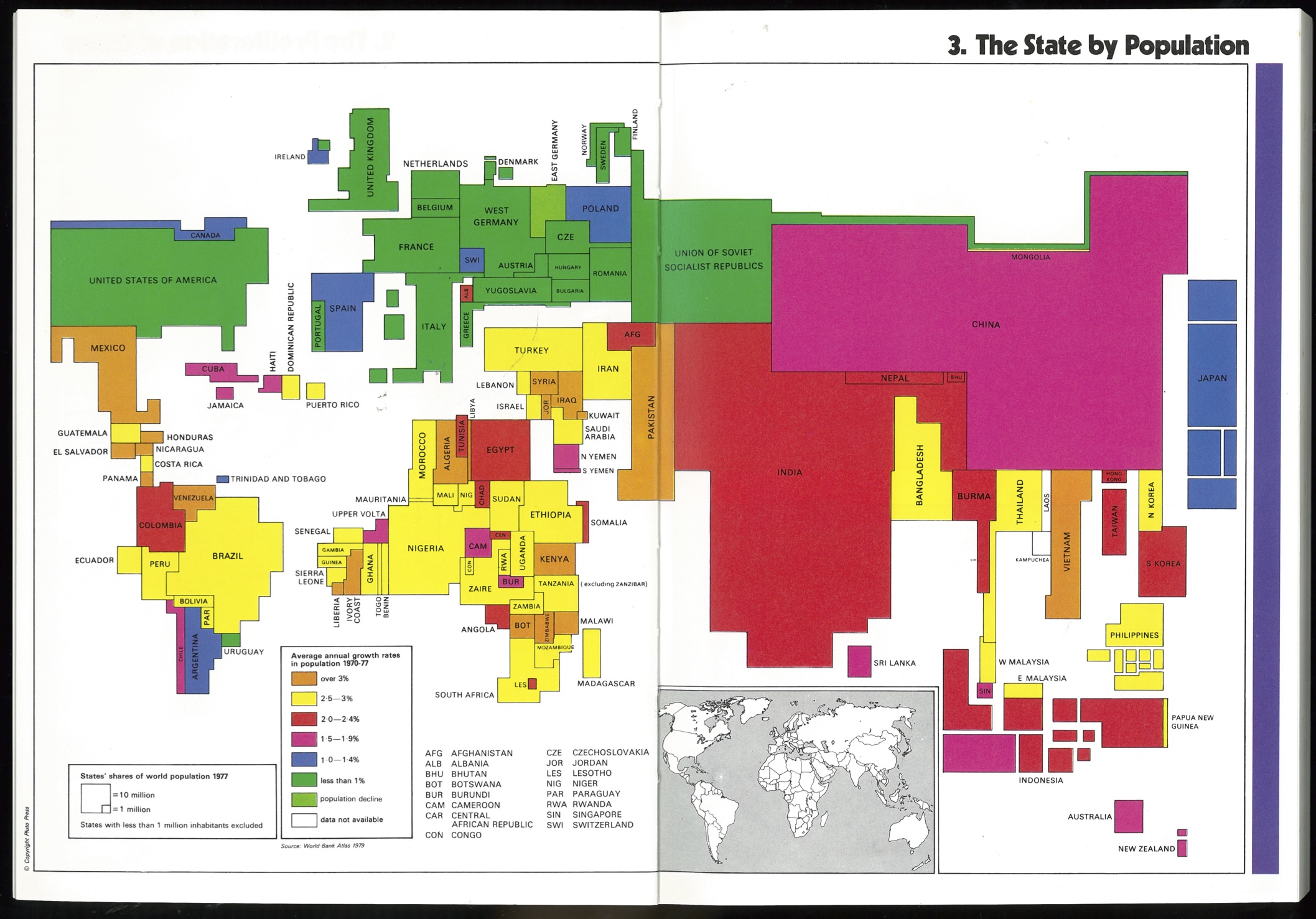
This map compares the populations of the world’s states in 1979 and gives their annual average growth rate during the seventies.
Population is shown by a graphic distortion which preserves the geographical relationship between the states. What emerges is an idea of how very different the world would look if the size of each state corresponded to its population. States with less than a million inhabitants have been excluded. A list of these is given on Map 2: The Proliferation of States.
Population growth rates are shown in colour. On current trends, a map of this kind produced year after year would show a marked and continuing decrease in the size of rich states relative to the rest.
For other graphically distorted maps, which give a different view of the world, see for example Map 23: National Income or Map 26: Government Income.
For many states, population figures are no better than inspired guesses. In the US, for example, the existence of a large illegal immigrant society, officially estimated at between two and twelve million (see note to Map 38: The Flight to Work) is among the many factors in the widely recognised under-recording of population. In others, recording and non-recording of population forms part of the political tussle between its constituent parts – as between the states in Nigeria. In yet others there are simply no provisions for a separate census administration and population figures are supplied by officials engaged in other seemingly more pressing, business and who have not necessarily been appointed for their numeracy.
HTML last updated on 29 November 2020